The Price of Biodiversity
This page shows part of my research at Aarhus University. The research uses home sales to estimate what the ecological quality of nearby nature is worth to Danish homebuyers, as reflected in the prices they pay. I have found no earlier estimate of the price of ecological quality in Danish or Scandinavian property markets.
Work in progress. This page summarises preliminary findings from an unpublished working paper. The estimates are associations that should not be read as causal effects and may change before the paper is released. The map shows ecological-quality scores and does not show property valuations. Last updated September 2026.
An implicit price of zero
When a road or a building is appraised, its costs and benefits are weighed in money. Biodiversity usually enters that calculation at zero, because no measurement of it reaches the appraisal.
Denmark has a national map of ecological quality, the Biodiversitetskort, that scores each part of the country for its potential to support wild species. My research asks whether Danish homebuyers pay more to live near higher-quality nature and, if they do, how much more.
Ecological quality across Denmark
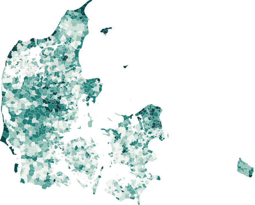
Average score within one kilometre of the homes sold in each parish, across about 964,000 recorded home sales, 2015 to 2025. Pick an index below. Darker always means richer nature.
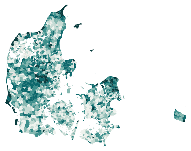
The interactive version of this map needs JavaScript. The figure above shows the same data: the average ecological quality within one kilometre of homes in each Danish parish.
How to read this. The colour shows the Biodiversitetskort score, a measure of habitat quality and the presence of species of conservation concern, averaged over the homes sold in each parish. A higher score means richer potential for wildlife. The colours sort parishes into six groups by rank, from very low up to the top few percent. They show how each parish compares with the rest of Denmark rather than against a fixed standard. A parish in the top group is among the richest in the country, which is not the same as a perfect score. This is not a property valuation, and it does not tell you what nature is worth for any individual home. Parishes with fewer than 30 sales are left grey because their average is too noisy to show.
What the three indices mean. The Biodiversitetskort score is the sum of two parts, a species score and a landscape score. The toggle above maps each on its own.
Composite (bioscore)
The full Biodiversitetskort score, species records and landscape quality together. This is the measure behind the price estimate.
Species (artsscore)
Threat-weighted records of red-listed wildlife actually observed nearby. It leaves out the coast and the other landscape proxies.
Landscape (proxyscore)
Habitat, wetlands, hedgerows, old forest, low nitrogen and coastal proximity, the conditions that predict where wild species are likely to live.
What the split shows. The price premium comes out about the same whether it is measured on the full score or on the species part alone. On its own that near-match is expected, since the species part makes up most of the full score. A stronger test, described with the distance chart further down, enters the two parts in the same regression, so that each is estimated with the other held fixed. When ecological quality is measured within 500 metres of the home, the species part accounts for the premium. Within 1 kilometre the two parts are too closely correlated for the test to separate them.
View the data as a table
Find your parish
Pick a parish to see where it sits in the national ranking, using the composite score for ecological quality and satellite NDVI for greenness.
Choose a parish above, or click one on the map, and its profile appears here.
Each parish with at least 30 sales gets one thin bar above, ranked from the lowest composite score on the left to the highest on the right and coloured by its band. The card is drawn in your browser and the button sends nothing. It downloads as a PNG image.
The parish profile needs JavaScript. The table under the map lists the scores for each parish.
What homebuyers reveal
Three findings from the analysis, stated in round numbers because the work is still preliminary.
Nature has a price
On average, homes surrounded by higher-quality nature sell for more. The bioscore, from the national Biodiversitetskort map, is an index of ecological quality scored 0 to 19 and averaged here within 1 kilometre of each home. When homes of the same type within the same parish are compared, one additional bioscore point is associated with about 2.8 percent higher prices. At the median sale price of DKK 2 million that corresponds to about DKK 57,500. The 95 percent confidence interval, the range of values compatible with the data at the conventional standard of statistical evidence, is DKK 40,000 to 75,000. Homes of the same type in the same parish typically differ by about half a point. One standard deviation of that within-parish variation, 0.56 points, is associated with about 1.6 percent higher prices, or DKK 32,000, with a 95 percent confidence interval of DKK 23,000 to 42,000.
Mostly about who lives where
Without adjusting for any other characteristic of the home or its location, one bioscore point is associated with about 10 percent higher prices across the country, roughly three and a half times the within-parish figure of 2.8 percent. Around seventy percent of that raw association reflects other differences between homes near high-quality nature and the rest, mainly the parishes they are in. I read most of that as spatial sorting, with buyers who value nature settling in parishes with high ecological quality. The premium that remains within a parish is smaller but still present.
A local effect
The premium is of similar size whether nature is measured within 100 metres or within 1 kilometre of the home. At 5 kilometres it is not distinguishable from zero. I read this as the profile of an amenity that residents use close to home, on walks nearby and through what they see and hear from home.
How it is measured
The estimate comes from a hedonic price model. It is fitted to about 850,000 geocoded home sales, the subset of the roughly 964,000 recorded sales shown on the map with complete information on each home characteristic and control the model requires, with controls for the size, age, and construction of each home, its energy rating, distance to the coast and to transport, noise exposure, and the general greenness of the surroundings. Comparing homes of the same type within the same parish, with nationwide price trends removed quarter by quarter, separates the role of ecological quality from the many other things that drive prices.
Greenness is not the same as biodiversity. A mown lawn and a species-rich meadow can look equally green from a satellite. The model holds greenness constant, so the estimate reflects ecological quality rather than just the amount of vegetation.
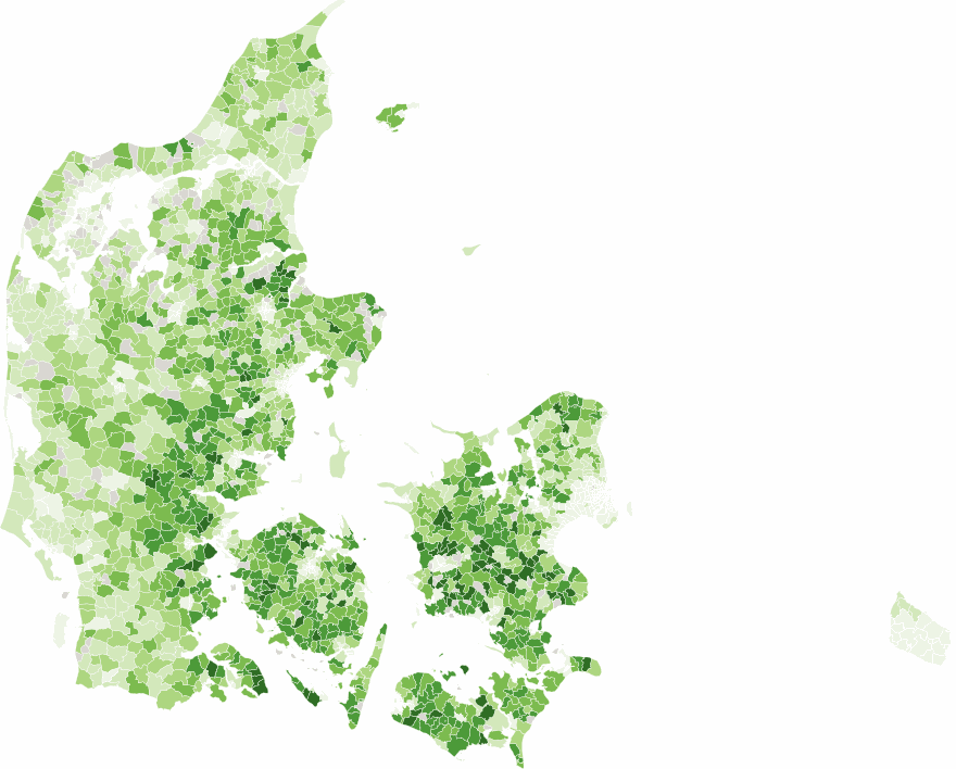
Across the roughly 964,000 home sales the two barely track each other, with satellite greenness and the composite ecological-quality score correlating at about r = 0.10, and they pull apart most in intensively farmed areas, where a bright green field can score low.
What this is, and what it is not
What it is
- An estimate of the value of ecological quality in the Danish property market, based on what homebuyers pay. I have found no earlier estimate of this value in Danish or Scandinavian property markets.
- A market-based price for the part of nature’s value that is reflected in house prices, for use in Danish cost-benefit analysis, where biodiversity usually enters at zero.
- A full account, including how much of the raw premium is explained by who lives where.
What it is not
- A property valuation, or a price for the nature near any single home.
- A causal claim. These are associations, with the limits any observational study carries.
- A finished result. The paper is unpublished and the numbers may change before release.
Explore it yourself
Four interactive tools in the Lab, built on this same research. Each link opens the Lab at that tool.
Nature Next Door
Move a slider along the local bioscore and read the price change linked to richer nearby nature, with its range.
Open in the Lab →The Sorting Machine
Play with spatial sorting, the tendency of buyers who value nature to settle near it, and watch the raw premium shrink to the within-parish figure of about 2.8 percent per bioscore point.
Open in the Lab →Is greener always richer?
Compare satellite greenness with measured ecological quality across the country, point by point.
Open in the Lab →Biodiversity in the business case
See how putting a price on nature changes a cost-benefit calculation for a project.
Open in the Lab →Where this fits
This is part of my research at Aarhus University on measurement, uncertainty, and decision-making in infrastructure and environmental policy. The aim is to give cost-benefit analysis a defensible price for biodiversity, so that the value of nature is counted rather than assumed away.
A short summary of the working paper sits with my other research. A link to the full paper will be added when it is released.
Data sources
Ecological quality: Biodiversitetskort (bioscore, 2021 edition), Danish Centre for Environment and Energy (DCE), Aarhus University.
Parish boundaries: DAGI, Styrelsen for Dataforsyning og Infrastruktur (SDFI) via Dataforsyningen, licensed CC BY 4.0.
Property transactions: Boliga.dk, 2015 to 2025.
Building characteristics: the national building register (BBR), via Datafordeler.
Energy labels: EMOData, Danish Energy Agency (Energistyrelsen).
Noise: strategic noise maps for 2017 and 2022, Danish Environmental Protection Agency (Miljøstyrelsen).
Train stations: © OpenStreetMap contributors, available under the Open Database License.
Greenness: Normalized Difference Vegetation Index from a Sentinel-2 summer 2021 composite.
Referring to this work: the working paper is titled “The Price of Biodiversity: Hedonic Evidence from Danish Housing Markets” and is not yet published. For press questions, use the contact page.
Interested in this work?
I am always glad to discuss biodiversity valuation, environmental cost-benefit analysis, and the economics of nature.